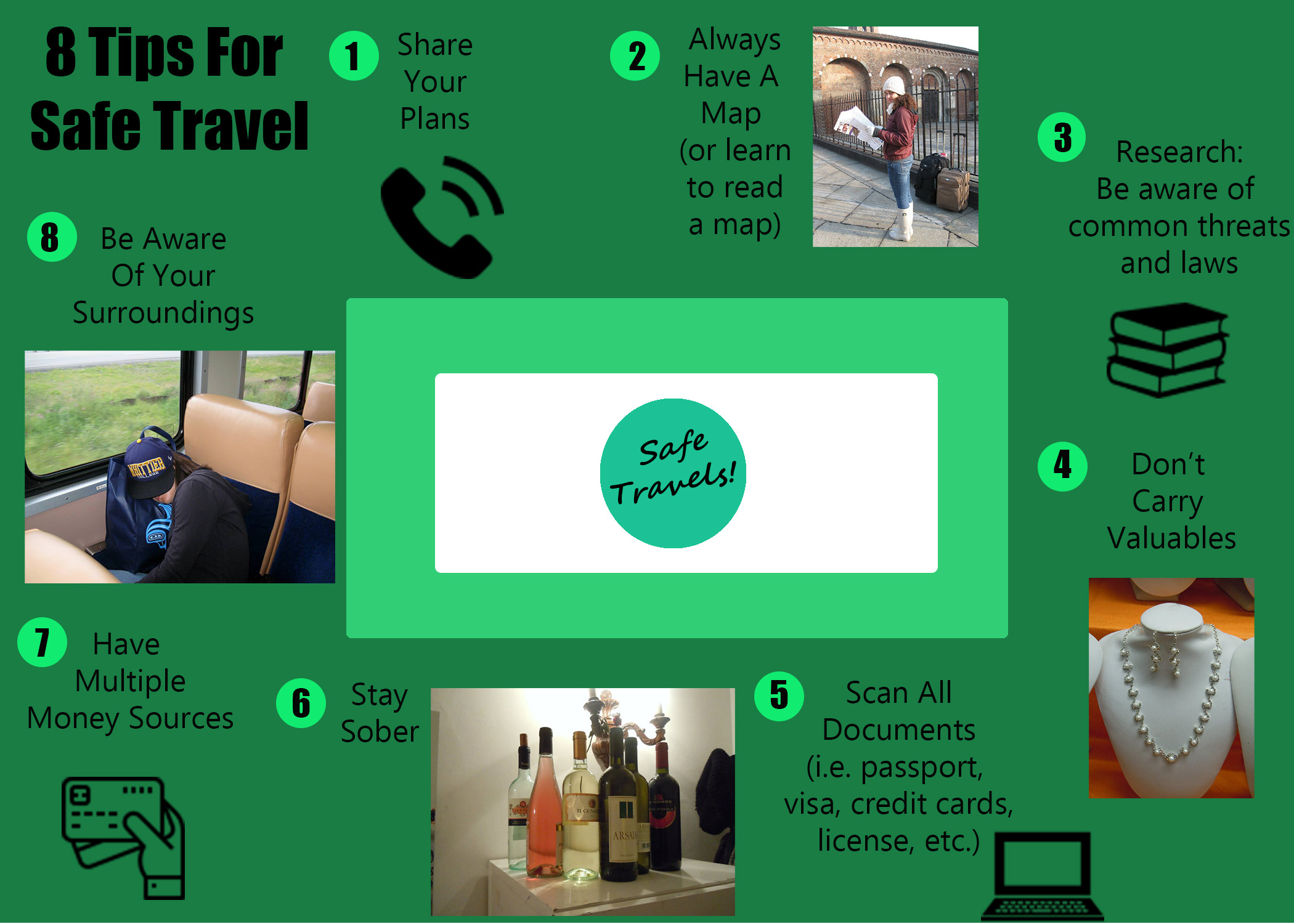
IDEAS AND INSPIRATION
For this project I decided to create a graphic that shows a few of the safety tips I suggest when traveling. It relates well to my topic because they are tips that I am either glad I have done or wish I had done while traveling.
DESIGN PROCESS
I researched other travel blog safety tips, as well as the visuals they used to show these tips. However, I ultimately ended up being most inspired by a graphic from a travel company rather than a blog. I tried to use the four most relevant principles of Gestalt Theory. The words and images that are most closely related are using the law of Proximity to help show that they belong together. The tips are placed around the outside of a box, giving it a sense of Continuation. The images that are not personal photographs all use the law of Similarity, as they are similar in shape, size, and color. And all the tips go entirely around the box, giving it a sense of Closure.
The images chosen were identified as a symbol of the text related to their tip. The green colors are analogous colors, which I chose because I feel like green is a safe, calming color that hopefully shows that if you follow these safety tips travel can be a safe undertaking. There are also two fonts in the graphic, both of which are sans serif fonts, as I felt that there was a lot of other things to look at in the graphic and wanted fonts without flourishes to keep from being distracting. Also, the title and the numbers are bolded to intensify the contract between the text and the background. The text originally reads from left to right, and top to bottom, but it also flows in a circle, meaning at the end you are actually reading from right to left and bottom to top.
TECHNICAL DETAIL
The photos are old travel photos of mine, and the other graphics were attained through a free website (see below for details). In creating the graphic I used almost 40 layers in PhotoShop. The tools I used the most were the Move Tool, The Rounded Rectangle and the Ellipse Tool, the Typing Tool, and the Paint Bucket Tool.
I struggled a lot with remembering how to do the things we learned in the last lesson, and spent the majority of the time looking for the instructions and trying to remember how to do things. I also struggled with having a lot of ideas I wanted to do, but not really being sure how and getting frustrated by needing to do things over and over again. I realize that is how I’ll learn, but it was definitely the biggest challenge for me.
SOURCES AND MATERIALS
Four of the images in my graphic were not created by me. Below you will find the links to the graphics used. All four images are from the same site, which has a Free License (with attribution) license, allowing for gree use of their content as long as its attributed to the author (which they all are here on this blog post).
https://www.flaticon.com/free-icon/telephone_126341
https://www.flaticon.com/free-icon/books-stack-of-three_29302
https://www.flaticon.com/free-icon/debit-card_1087117#term=money&page=1&position=46

I really like your project because it flows well and is very organized which draws people’s attention more than a messy look. One thing that I did think could make it look more attractive is to create a different color scheme. Most everything on here is very green or some color very close to green, and I think if you mix green with a different color like a gold or brass color it would be very eye catching. One other thing that may be helpful would to put boarders on your photos and/or the words. That way everything can be tied together because sometimes plain photos look a bit out of place on their own. But overall, it flows very well, very good job!
LikeLike
The feedback I received was to add something to my color scheme, and also to add boarders to my photos. I think these are both great suggestions, and will make these adjustments in my final project. I like the idea of adding some gold to my color scheme to go with the green. I had not thought of adding a boarder to the photos, but I agree that this would give it a more professional look. So far I have not received any other feedback, but I will take that feedback into account when I get it before Friday. The other students have until midnight tonight to submit that feedback, but tonight is very busy for me, so I will not be able to do a self-critique based on their feedback later in the evening than now. However, there are a few things I’d change just for me. Personally, I also am not a huge fan of the photo I have of wine. I think I would like to replace it with something else, but would need to make it a priority this week before Thursday night to stage a photo of alcohol. I also think that if I can get the sizes of the personal photos to be more similar it will look more cohesive. This may be difficult because they go different directions, but I will try to make this adjustment.
LikeLike
I really liked how overall your graphic Is very coherent and that as soon as you look at it you see the title and then you follow a very natural eye line throughout your 8 steps. I think maybe adding in a bit more variation in color to maybe stand out from the green might make things pop a bit more. I also think maybe adding a way you could do some things might help. For example, looking up common threats and laws maybe also include a place the viewer might be able to go and look and check things for the place/places they want to visit. I also think that the central aspect is kind of distracting from the whole graphic because of the color contrast and its positioning it stands out a lot, and takes the viewers eyes away from the natural path you have your 8 steps going.
LikeLike