Initial Draft Process
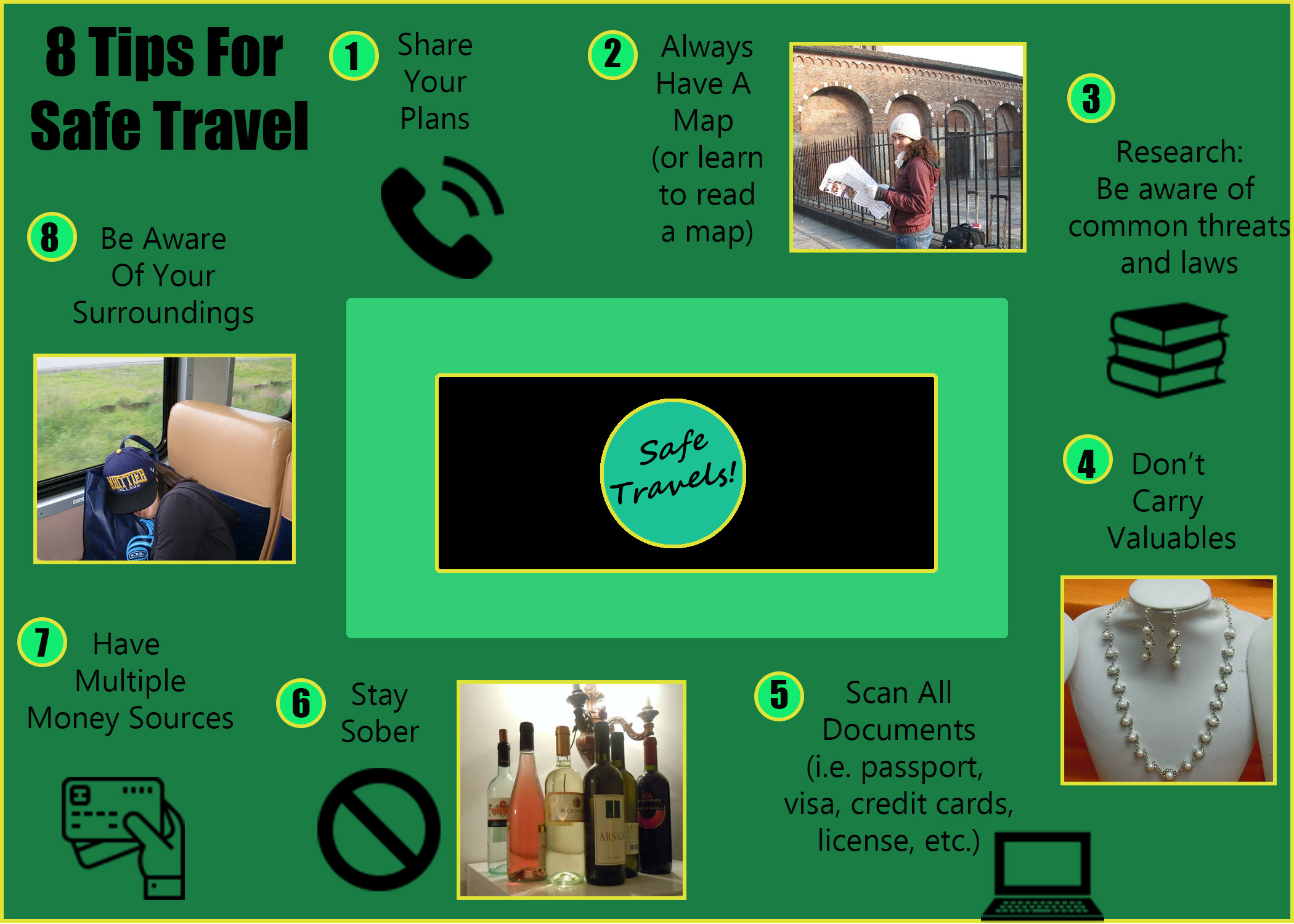
The initial draft of this project game from reading a lot of travel blogs focused on safety tips for women traveling solo. The topic relates to my overall blog because both focus on travel tips. Originally I planned to use these blogs as inspiration, but ended up liking a graphic from a travel company instead, and used their idea to list the tips in a circle.
The original design process used the four main principles of Gestalt Theory, including the law of Proximity for the words and images, Continuation and Closure with the arrangement of the tips, and the law of Similarity with the shape, size, and colors. The images were chosen to symbolize the text they represent, green was chosen because it feels like the analogous colors create calm, and two sans serif fonts were chosen to keep from being distracting.
The photos are travel photos of mine, and the other images are from a free website, with a Free License (with attribution) license. You will find the sources below:
https://www.flaticon.com/free-icon/telephone_126341
https://www.flaticon.com/free-icon/books-stack-of-three_29302
https://www.flaticon.com/free-icon/debit-card_1087117#term=money&page=1&position=46
Final Draft Process: Design Revise
After the Initial Draft was the feedback period. It was suggested that I make the following Updates:
- Add an image that indicated that the wine photo is about staying sober, not drinking
- Make the photos the same size
- Add other colors to the graphic besides green
- Make the middle box less distracting
- Add borders to make the images stand out
- Add more detail on where to find more information about the tips listed
- Change the overall blog color
Taking this feedback into consideration I made the following changes:
- I added a black no sign, like the kind you might find on a traffic sign, next to the wine photo. I am hoping that it will read like “no wine’ to the audience.
- I made the impages closer in size. The are not exact, as this would have cut off more of the images than I wanted, but they are much more similar in size.
- I added gold borders to the images, numbers, and as a graphic border to enhance the green and highlight the images.
- I made the middle box black rather than white to try and make it more understated
I decided not to add more details of where to get this information to the graphic, as I felt that there was not room and would make it look squished. However, this information could be added to a blog post where I go into more detail about each tip.
I also opted not to change the overall colors of the blog, as I wanted to focus on the graphic this week instead.
The only image that was added was the “no” sign, but I obtained from the same website as the other graphics, for consistency. You will find the source below:
https://www.flaticon.com/free-icon/no-stopping_803253#term=no&page=1&position=2
