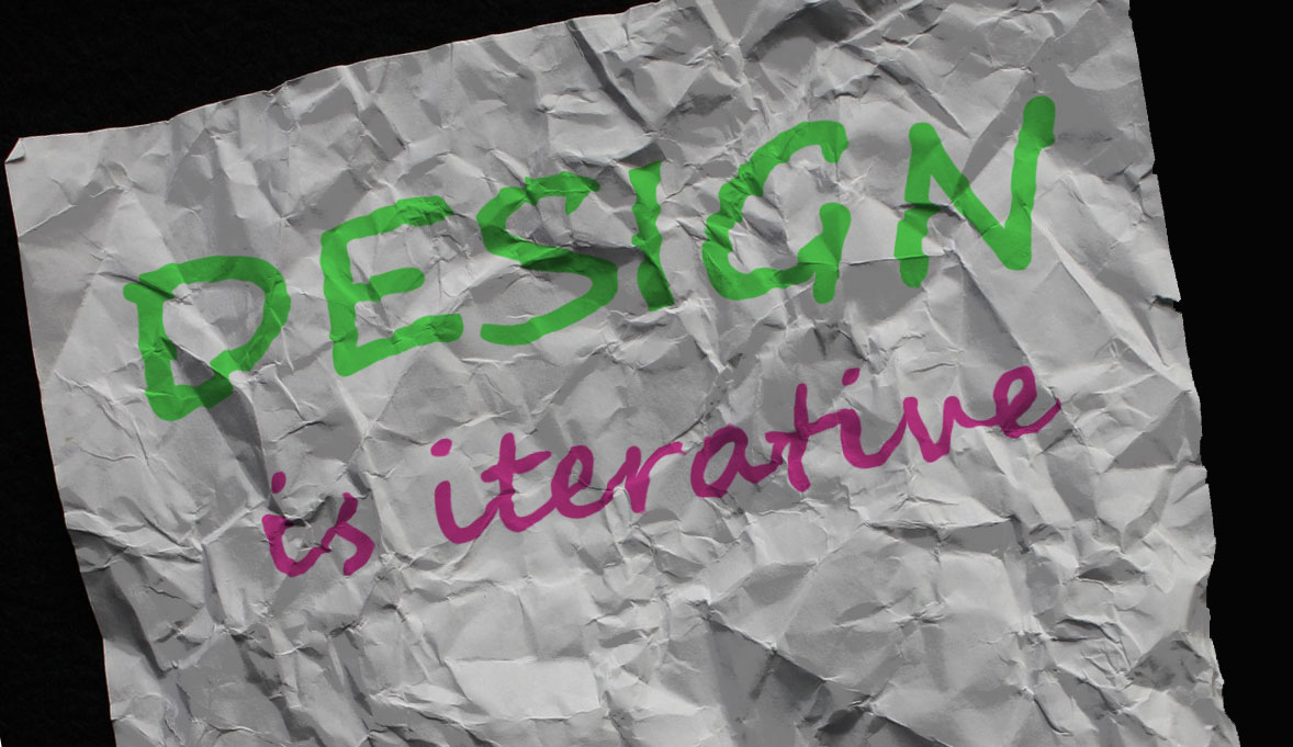
The Logo for my Love of Lost blog will have a labyrinth in the center, with a compass around the outside. The labyrinth is a symbol of a journey and the compass is a symbol for travel, and often used for travel blogs.
Final Graphic Design Project
Initial Draft Process
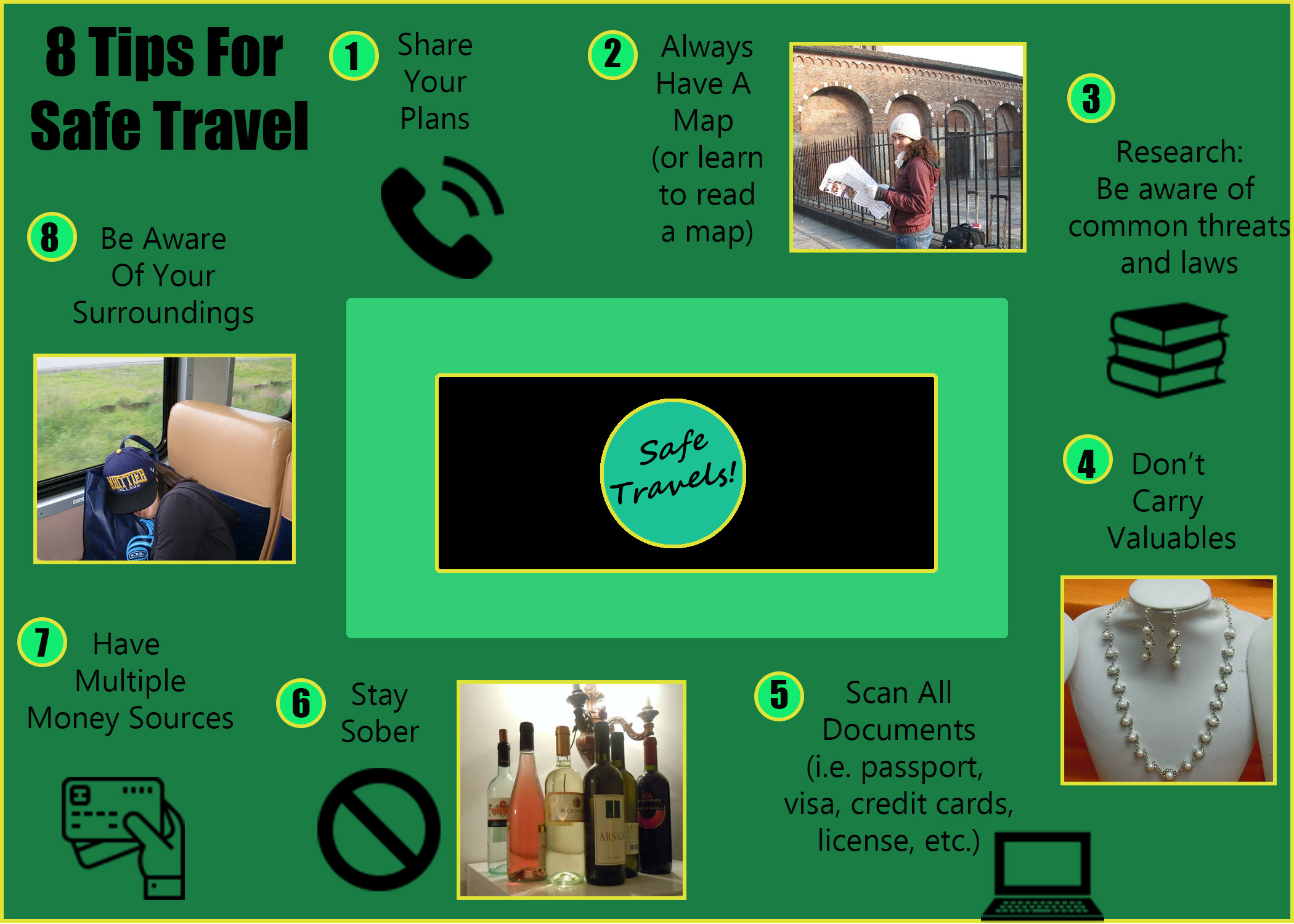
The initial draft of this project game from reading a lot of travel blogs focused on safety tips for women traveling solo. The topic relates to my overall blog because both focus on travel tips. Originally I planned to use these blogs as inspiration, but ended up liking a graphic from a travel company instead, and used their idea to list the tips in a circle.
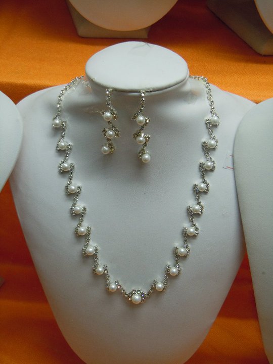
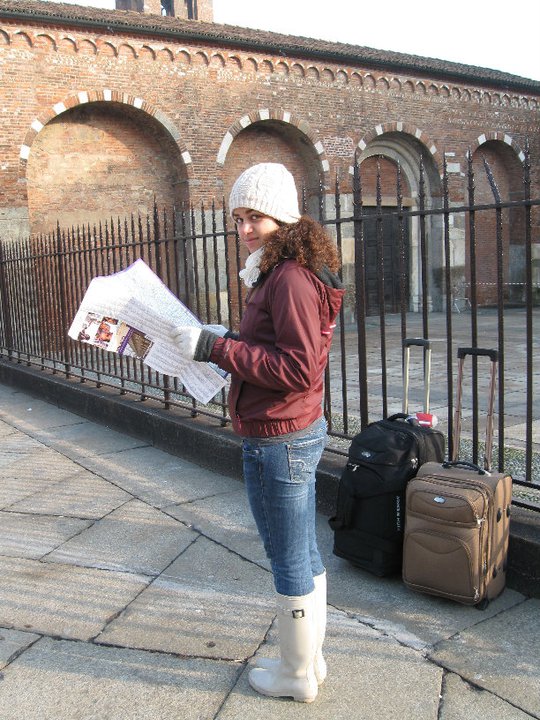
The original design process used the four main principles of Gestalt Theory, including the law of Proximity for the words and images, Continuation and Closure with the arrangement of the tips, and the law of Similarity with the shape, size, and colors. The images were chosen to symbolize the text they represent, green was chosen because it feels like the analogous colors create calm, and two sans serif fonts were chosen to keep from being distracting.
The photos are travel photos of mine, and the other images are from a free website, with a Free License (with attribution) license. You will find the sources below:
https://www.flaticon.com/free-icon/telephone_126341
https://www.flaticon.com/free-icon/books-stack-of-three_29302
https://www.flaticon.com/free-icon/debit-card_1087117#term=money&page=1&position=46
Final Draft Process: Design Revise
After the Initial Draft was the feedback period. It was suggested that I make the following Updates:
- Add an image that indicated that the wine photo is about staying sober, not drinking
- Make the photos the same size
- Add other colors to the graphic besides green
- Make the middle box less distracting
- Add borders to make the images stand out
- Add more detail on where to find more information about the tips listed
- Change the overall blog color
Taking this feedback into consideration I made the following changes:
- I added a black no sign, like the kind you might find on a traffic sign, next to the wine photo. I am hoping that it will read like “no wine’ to the audience.
- I made the impages closer in size. The are not exact, as this would have cut off more of the images than I wanted, but they are much more similar in size.
- I added gold borders to the images, numbers, and as a graphic border to enhance the green and highlight the images.
- I made the middle box black rather than white to try and make it more understated
I decided not to add more details of where to get this information to the graphic, as I felt that there was not room and would make it look squished. However, this information could be added to a blog post where I go into more detail about each tip.
I also opted not to change the overall colors of the blog, as I wanted to focus on the graphic this week instead.
The only image that was added was the “no” sign, but I obtained from the same website as the other graphics, for consistency. You will find the source below:
https://www.flaticon.com/free-icon/no-stopping_803253#term=no&page=1&position=2
Graphic Design Project
IDEAS AND INSPIRATION
For this project I decided to create a graphic that shows a few of the safety tips I suggest when traveling. It relates well to my topic because they are tips that I am either glad I have done or wish I had done while traveling.
DESIGN PROCESS
I researched other travel blog safety tips, as well as the visuals they used to show these tips. However, I ultimately ended up being most inspired by a graphic from a travel company rather than a blog. I tried to use the four most relevant principles of Gestalt Theory. The words and images that are most closely related are using the law of Proximity to help show that they belong together. The tips are placed around the outside of a box, giving it a sense of Continuation. The images that are not personal photographs all use the law of Similarity, as they are similar in shape, size, and color. And all the tips go entirely around the box, giving it a sense of Closure.
The images chosen were identified as a symbol of the text related to their tip. The green colors are analogous colors, which I chose because I feel like green is a safe, calming color that hopefully shows that if you follow these safety tips travel can be a safe undertaking. There are also two fonts in the graphic, both of which are sans serif fonts, as I felt that there was a lot of other things to look at in the graphic and wanted fonts without flourishes to keep from being distracting. Also, the title and the numbers are bolded to intensify the contract between the text and the background. The text originally reads from left to right, and top to bottom, but it also flows in a circle, meaning at the end you are actually reading from right to left and bottom to top.
TECHNICAL DETAIL
The photos are old travel photos of mine, and the other graphics were attained through a free website (see below for details). In creating the graphic I used almost 40 layers in PhotoShop. The tools I used the most were the Move Tool, The Rounded Rectangle and the Ellipse Tool, the Typing Tool, and the Paint Bucket Tool.
I struggled a lot with remembering how to do the things we learned in the last lesson, and spent the majority of the time looking for the instructions and trying to remember how to do things. I also struggled with having a lot of ideas I wanted to do, but not really being sure how and getting frustrated by needing to do things over and over again. I realize that is how I’ll learn, but it was definitely the biggest challenge for me.
SOURCES AND MATERIALS
Four of the images in my graphic were not created by me. Below you will find the links to the graphics used. All four images are from the same site, which has a Free License (with attribution) license, allowing for gree use of their content as long as its attributed to the author (which they all are here on this blog post).
https://www.flaticon.com/free-icon/telephone_126341
https://www.flaticon.com/free-icon/books-stack-of-three_29302
https://www.flaticon.com/free-icon/debit-card_1087117#term=money&page=1&position=46
Photo Collection Assignment
My Adobe Photoshop project will shows some of the ways to stay safe while traveling.
Photoshop Tutorials
Here are my completed tutorials.
Introduction to Topic: Travel Tips
Why Travel Tips
One of my favorite authors, Toni Morrison, once said “If there’s a book that you want to read, but it hasn’t been written yet, then you must write it.” Well, this isn’t exactly a book, but idea still stands. I have chosen to focus on travel tips as my topic for the purposes of WSU’s COM 210 class because I’ll be sharing information that I wish I knew when I first started traveling. These are tips that I often share with friends, family, and my students, but would now like to able to share with them with a larger audience.
What Kind of Travel Tips
For each of the three unit projects I plan to address some of the travel questions I get asked most frequently. For example, for Unit 1 I hope to create a project with Adobe Photoshop that shows some of the ways to stay safe while traveling. For Unit 2 I hope to create a logo with Adobe Illustrator for my Love of Lost travel blog. For Unit 3 I hope to use audio storytelling with Adobe Audition to discuss ethical issues related to travel, like shopping local, the treatment of animals for tourism, voluntourism, and ways of traveling more meaningfully and sustainably. And for Unit 4 I hope to use Adobe Premiere to create a video showing some tips for minimalist packing.
How I’ll Share
To collect the materials I’ll need for these units I’ll be going through some of my old travel photos, as well as taking some new photos, and all new audio and video content. While my topic is focused on international travel, the specific tips can be demonstrated from home. For example, the video showing minimalist packing tips can be created anywhere, as normally packing is done at home for an international trip anyway.
The following are inspirations for my upcoming projects. The first is a graphic is from another travel blog focused on safety specifically for women traveling alone. The graphic can be found half way through the post, and shows multiple safety tips along a wavy line. Another inspiration is a website with a logo section dedicated to labyrinths and mazes. For the Love of Lost logo I’d like to incorporate a labyrinth of some sort, and I have found this link to have a lot of different ideas. The third inspirational link is a video showing a vlogger’s tips for packing a suitcase. I like the way this vlogger set up the packing video, as opposed to a lot of other packing videos that are more focused on the vlogger than the packing.
Looking forward to sharing my tips.
Let’s get lost!
Courtney
About
“A ship is always safe at the shore, but that is not what it is built for.”
— Albert Einstein
Hi. I’m Courtney Anne Jackson! Welcome to Love of Lost, a travel blog created for the COM210 course.
I’ve spent the greater part of the last 10 years traveling and teaching others about safe, sustainable, and meaningful travel. On this blog I’ll share some of the lessons that I’ve learned over the years, and provide resources for new international travelers. I’m a travel junkie! I’m happiest when I’m somewhere I’ve never been before. I’m always looking to learn more about the world and myself, and the best way I know how to do that is to get lost, i.e. Love of Lost. Love of Lost is about learning to love travel even when you’re off the beaten path, both literally and figuratively. It’s about finding your own path, and having fun along the way. I believe that life is about the journey, not the destination. Life has a lot of curves, and while we may not always know which road we’ll end up on, I believe that the unexpected can lead to something even better.
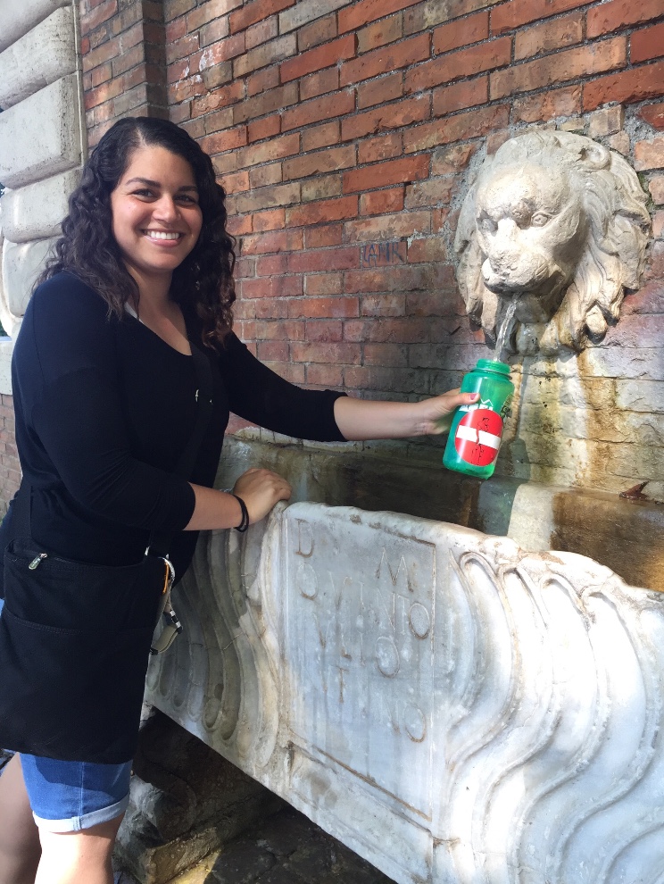
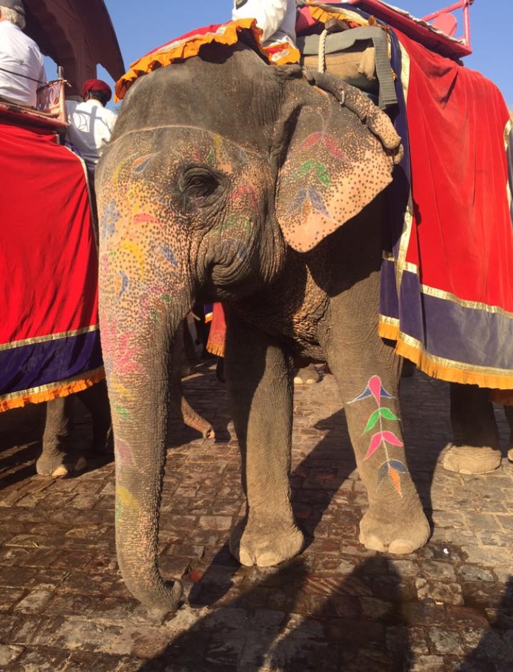
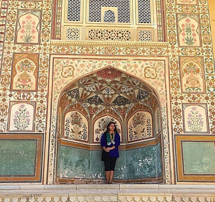
I am originally from Northern California, but have been everywhere from Italy, Costa Rica, India, and Chile to living in Washington DC, Los Angeles, San Francisco, and now Idaho. When I’m not traveling I am dancing, swimming, or taking classes to build my skills. As a lifelong learner, my career goals are to continue to be an advocate for experiential learning and find creative solutions that make cross-cultural opportunities accessible to everyone.
I hope that the travel tips shared here will help you feel empowered to get lost too.
Courtney
